Attention all marketers and brand enthusiasts! Did you know that a QR Code doesn’t have to be plain black and white? That’s right, QR Codes can be customized to match your brand’s color scheme, integrate your logo, feature patterns or even have animations! Don’t settle for a boring QR code that blends in with the rest, make your QR code pop with a customized design. Whether you want rounded corners for a more friendly look or a patterned design to make it stand out, the options are endless. So why not upgrade your QR Code game and showcase your brand’s creativity today!
Introduction: The Basics of QR Codes
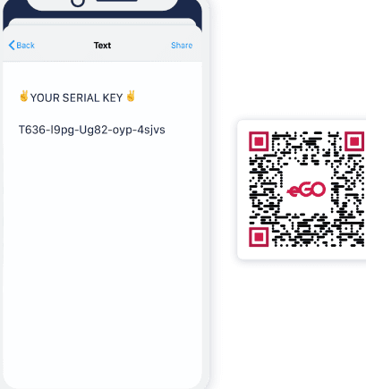
QR codes have been around for some time now, and they are becoming increasingly popular as a marketing tool. These square-shaped barcodes can hold an abundance of information, including URLs, contact information, and even payment information. The best part about QR codes is that they are scannable using a smartphone camera. When you scan a QR code with a smartphone, it automatically takes you to the information stored within it.
The basic form of a QR code is black and white, and it consists of a pattern of squares and rectangles. But, there is a common misconception that QR codes must be black and white. The truth is that QR codes can be customised in several ways to add more flair and creativity.
QR Codes and Color
Many people believe that QR codes must be black and white. However, this is far from the truth. QR codes can be customized in many colors, depending on the kind of message or brand that you want to convey. Colors in QR codes not only affect the aesthetics but impact the usability of the code as well.
QR codes versions can hold up to 4,296 characters, making it a complicated pattern to scan for a phone camera. Different colors in the code manipulate the compatibility of the code with various phones.
Using Colors for Better Scanning
Using different colors in QR codes can enhance the scanning experience for users. Colors in the code can assist the camera in distinguishing different parts of the code, including the finder patterns, alignment patterns, timing patterns, and data for higher recognition rates. When using colors to improve readability, it is essential to find the right balance between creativity and functionality.
Pro Tip: The contrast between color and background is vital in QR code readability. A light-colored QR code will not scan correctly with a white backdrop as the code’s squares and patterns tend to blend, obstructing the camera’s readability.
Bright Colors and QR Code Scanning
Bright colors might look appealing, but they might not be the best option when it comes to QR codes. Vibrant hues are challenging for cameras to read, making it difficult to scan the code. Pro tip: Stick to a minimum combination of bright colors for QR codes as this will accidentally compromise the readability of the barcode, making it challenging to scan.
The Benefits and Drawbacks of Using Color in QR Codes
Benefits
• Improved readability for QR codes for specific smartphones
• Captivating and visually appealing
• Brand recognition and customization
Drawbacks
• Risk of compromising QR code readability
• Some smartphones may fail to recognize the code
• Additional cost for customizing the codes
QR Codes with Custom Colors: How to Create Them
QR codes with custom colors are achievable with the right tools. Several online QR code generators have made it possible to customize your codes to your liking. Most QR generators allow users to add several colors, including the code’s background, foreground color, and pattern colors. Be careful not to over-optimize as this may compromise the code’s readability.
Best Practices for Using Color in QR Codes
1. Test before Launching: Before going live, be sure to test the code across different devices and lighting conditions.
2. Optimize for Print Quality: Ensure that the code’s print quality is of high quality to ensure optimal scanning results.
3. Consistency: Avoid constant color changes, stick with a consistent color scheme to build brand recognition.
4. Emphasize Contrast: The contrast between the code and the background is crucial for readability. Avoid using light colors with white backgrounds or dark colors with black backgrounds.
5. Keep it simple: Do not over-optimize the code with too many colors, instead opt for a few complementary colors for aesthetics.
Conclusion: Colorful QR Codes Await
Eye-catching and creative QR codes are now an option with the addition of color customization. Although this comes with its challenges, it is an excellent opportunity to integrate creativity and innovative solutions with QR codes for stronger brand recognition. By practicing these best methods and keeping a balance between aesthetics and readability, we can all create dynamic and engaging QR codes.